Learning by building
For me, the most fun way to learn a new technology is to build a project of my own. When I wanted to experiment with Vue.js and manipulating text on an HTML5 canvas, I didn’t set out to build a batch watermark app. But while working, the thought that this could actually become a useful tool really began to emerge. I got excited about the prospect of publishing something that others would find useful. So, my mindset began to shift from “What can I do with Vue and canvas?” to “How can I make this into a tool people would actually use?”
Not all features are necessary
Before I continued to build, I did a bit of research. Other online image watermarking apps were either outdated, had too many features, or didn’t let you add multiple images at once. Many were tough to use on mobile and touch screen devices. With this in mind, I decided to create a focused, easy-to-use tool to watermark a bunch of photos at once.
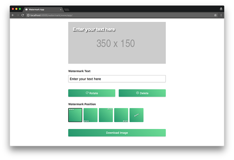
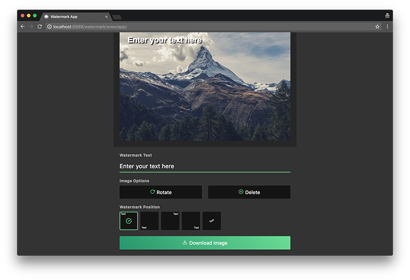
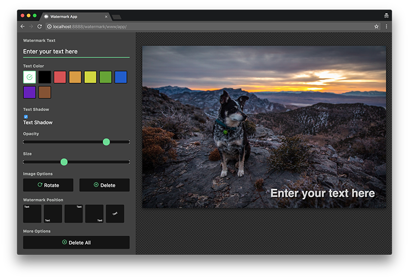
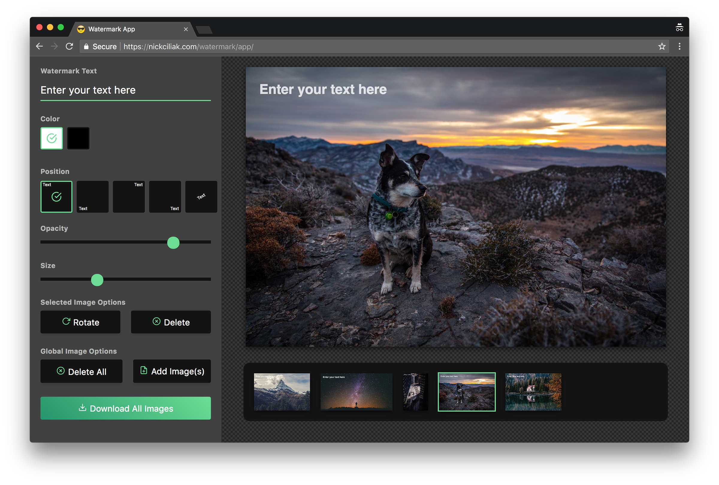
As I developed options and features, the UI design progressed naturally (above). It was fun to add lots of features—what if you could change the text color, add a text shadow, and adjust the letter spacing? But I quickly realized that too many options can be a bad thing. The UI became cluttered and the app lacked the simplicity that it previously held. In order to keep the product focused and true to my vision, I cut out unnecessary features.


