Modular by design
Graber Blinds wanted to differentiate as an attainable luxury window treatments brand while also streamlining their many product lines in an easy to understand way. Graber's products span multiple product lines, each with overlapping styles, features, and options available. Knowing this, our team focused on designing reusable components out of smaller elements to create a design system that would allow for rapid layout building. This modular thinking permeated our entire process, from determining the sitemap to wireframing to creating comps.
Once our brand team solidified the new direction of the Graber Blinds identity, I worked on designing comps for some of the more unique pages on the site. Because of the reusable components we created, most pages didn’t have to be fully designed before we started development. We were able to save time while working efficiently as a team.
Setting up the front-end
My team trusted me to set up the Sass and JavaScript architecture that we would use to build the site. I determined the JS build processes, how the Sass would be written and organized, and how our code overall would manifest the design system and modular mindset we’d been working with. My goal was to create a maintainable, future-friendly system that empowered everyone to write concise, structured, and reusable code.
Approaching the Sass
BEM naming conventions seemed to be the best fit for this project as the designs contained many reusable components and blocks. Since most people on my team weren’t familiar with it, I had the pleasure of helping them get started. Armed with BEM tips and resources, they caught on quick and soon the other developers on my team were writing code that was structured and easy to understand.
Spacing and typography styles were handled using declarative classes separate from the BEM naming conventions. This helped us promote visual consistency and save on overall CSS file size since these elements were heavily reused across the site.
Breaking Down the JavaScript
I knew that we had to build a few JavaScript-heavy pages such as Order Free Swatches, the Design Gallery, and the Product Advisor. To help with some of the heavy lifting of building these app-like pages, I recommended using the Vue.js framework. Since the rest of the site had relatively simple JavaScript needs, I decided not to include the code for these sections on the rest of the site. This gave us a big performance win: visitors only have to download the hefty framework code on pages that actually utilize it. It also has kept our site-wide JavaScript lighter and easier to read.
Building the swatches page
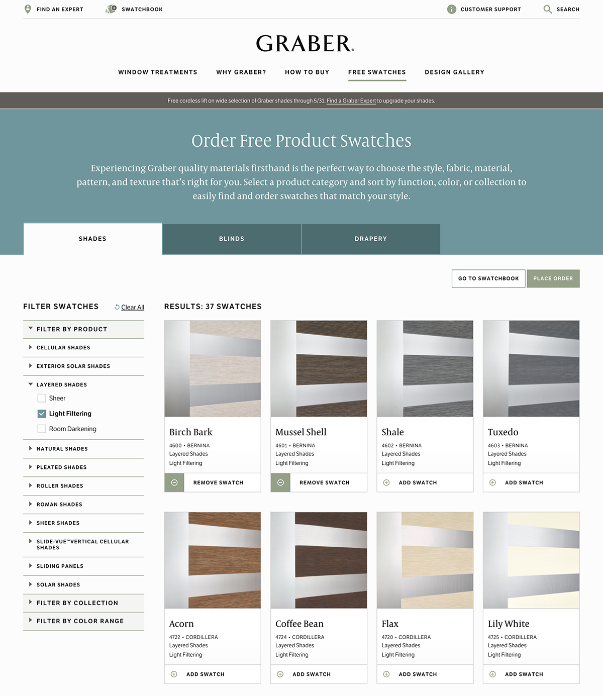
The Order Free Swatches page was one of the most fun and challenging parts of the site to design and build. Our client wanted to display all product swatches for each category (Shades, Blinds, Drapes) on one page, rather than have a swatches page for each individual product line like on their previous site.
This presented a couple of design and development challenges. For instance, under the Shades category, there are a lot of product lines and options that needed to be displayed under each swatch. Each of those needed to be an option to filter by as well. For development, we were restricted to using the API provided by the client’s IT team that was set up for the old version of their site. This meant I had to get creative with the way I loaded the swatch data into the page—it requires over 10 API calls to get just the Shades swatches loaded, but the page is set up to be usable by the time the first call is returned.
Nods to ecommerce
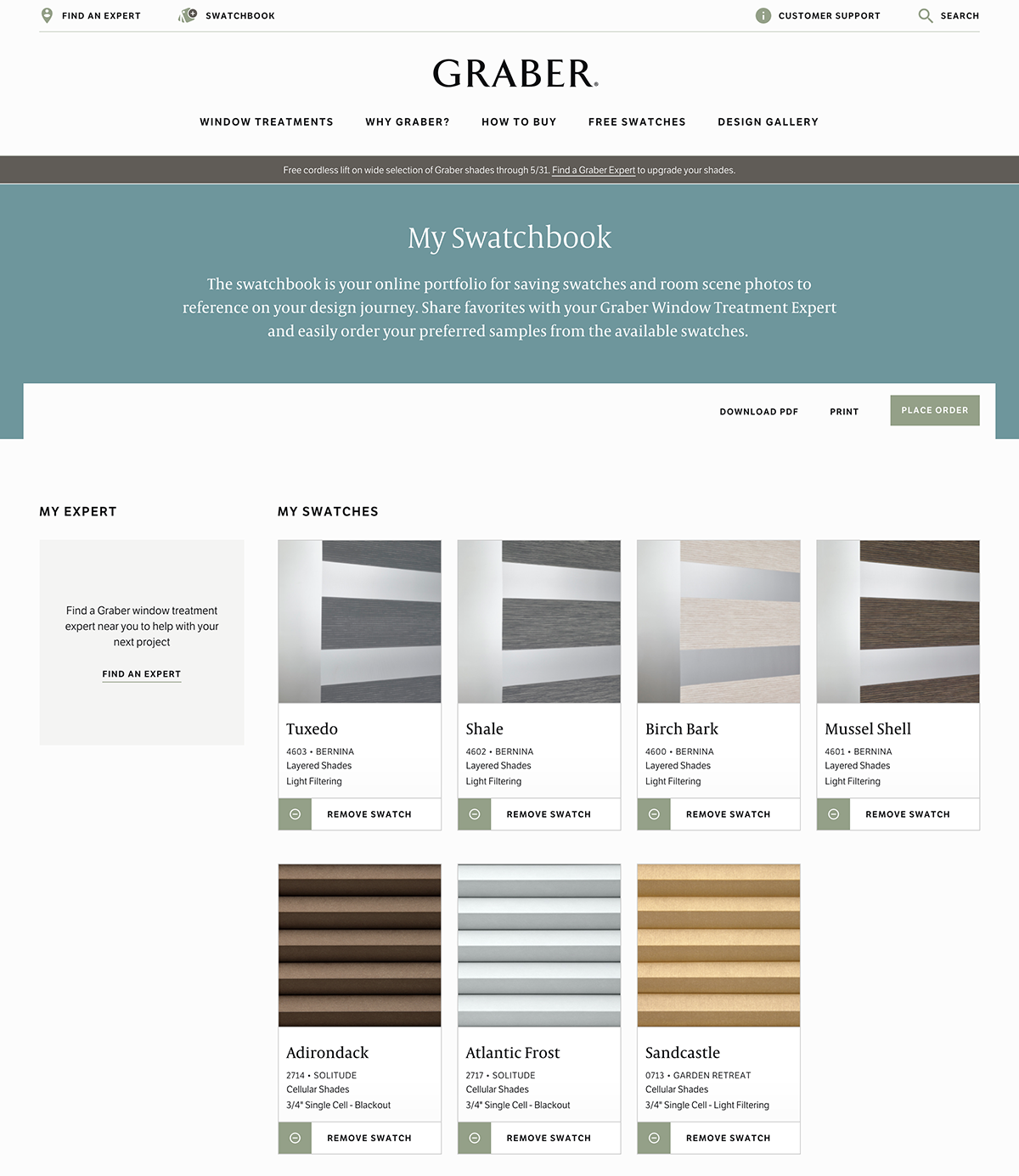
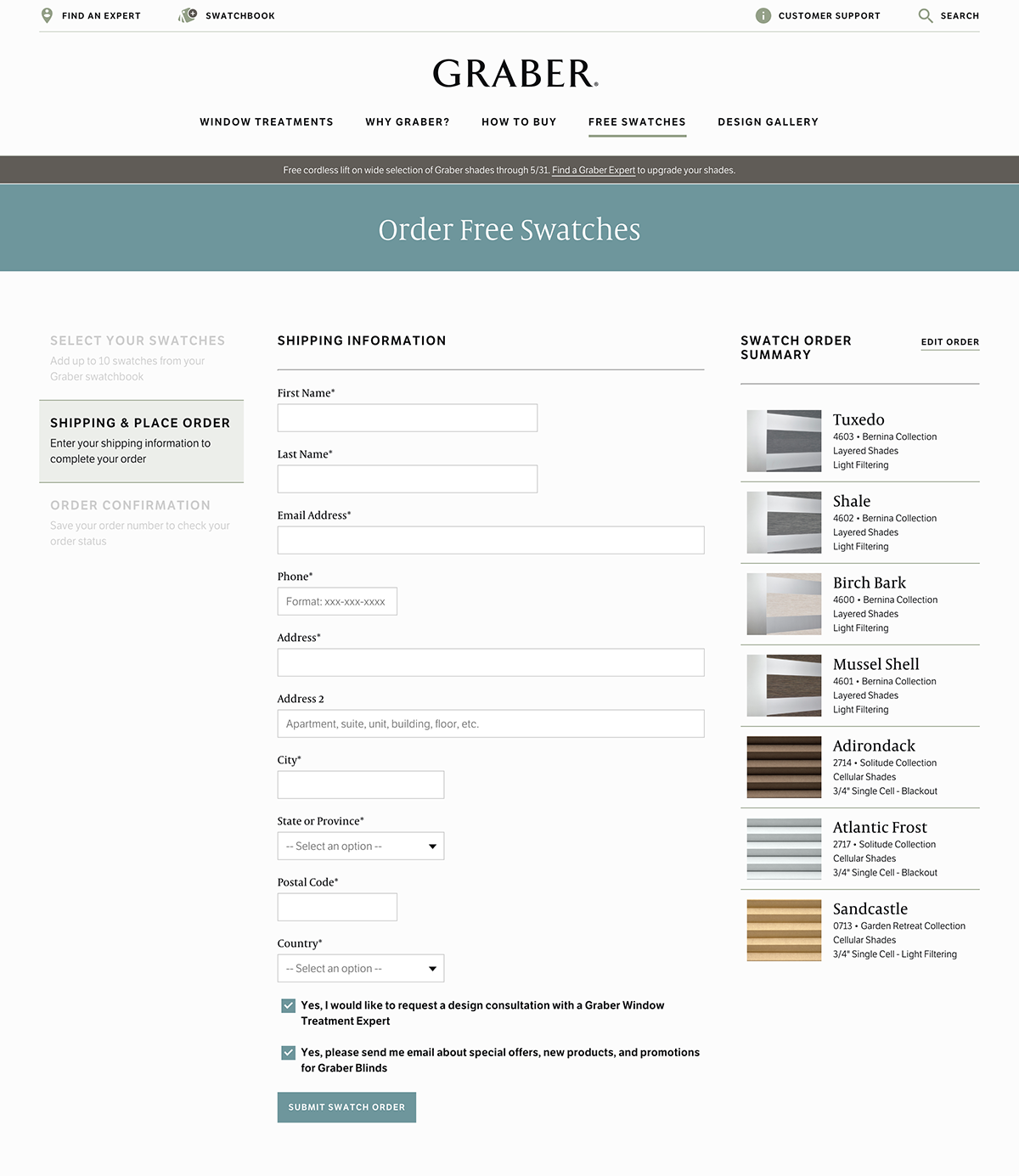
Our client wanted to prevent the Order Free Swatches page from feeling like an ecommerce solution. An online store puts visitors in the buying mindset, but they wanted to emphasize the “free” in free swatches. Since users are familiar with ecommerce conventions, we suggested a middle ground to optimize conversions. In lieu of a traditional cart, we created a Swatchbook that holds a user’s saved swatches, photos, and Graber Experts. From their Swatchbook, a user can then “Place Order” and enter their shipping information to receive their free swatches.
The Swatchbook experience is pretty unique, so in order to make sure first time users would be successful ordering swatches, we kept other aspects more closely aligned with the traditional ecommerce experience. We kept a familiar expanding accordion/checkbox filtering convention as well as an infinite scroll on the swatches page in order to reinforce common ecommerce experiences. The Swatchbook and checkout experience kept the site from feeling too ecommerce-like, which helped lower the friction for lead generation.
UI interactions to add polish
I had fun adding little UI details and interactions to make the Order Free Swatches page feel snappy and polished. These included a small animated spinner to signify a request was being made, placeholder animations to indicate the content that was being loaded, and subtle transitions between button states.
Pre-launch confidence
The site is nearing launch. Although we have yet to track and analyze conversions and site usage, our team is already marking the project as an internal success. I attribute a lot of that to the way we agreed upon a modular mindset early on in the project and stuck with it throughout the design and build process. Thinking in small elements and components helped us create a flexible, robust system that made collaborating to design and build the new site a pleasure. ∎


