An interest in digital products
My interest in designing digital products has increased tremendously over the past few years. For my undergraduate design thesis, I wanted to continue to hone my digital design skills while flexing all of my design muscles in a multidisciplinary design project.
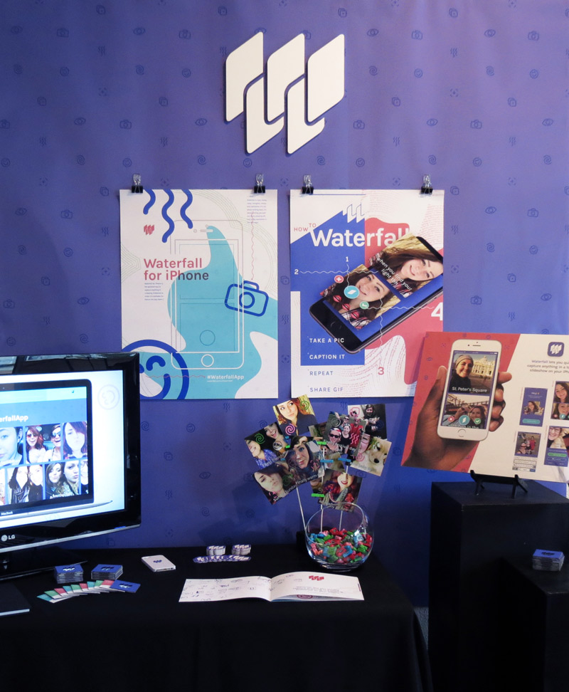
With an interest in social media and app design, I decided to explore the possibilities of designing an app that encouraged social sharing. There are many iPhone apps that continue to gain traction as modes of self expression with photos and videos. With Waterfall, I made it my goal to explore and create a new medium of personal expression using photos on the iPhone. I wanted to create a brand surrounding the app that would resonate with an audience of digital natives aged 12 to 24. In addition, I would design a presentation display to be presented in a gallery with my classmates as part of our final BFA exhibition.
Evaluating the selfie scene
By reflecting on the different ways in which people already create and share images on their iPhone, I came up with a new concept that allows folks to share multiple images at once, while adding captions. I initially prototyped a concept that allowed a group of friends to pass around a phone, with each person taking a selfie, and compile the images into one mega “selfie-chain” to share. (Kind of like a photobooth strip.) I quickly realized that...
After having these insights, I considered how the app could work if only one person were using it. The person could take multiple images in a row and compile them. Since super long and skinny images aren’t very shareable, I could “stack” the images and create a frame animation with a 1.5 to 2 second delay time. Thus, the app would create little photo slideshows.
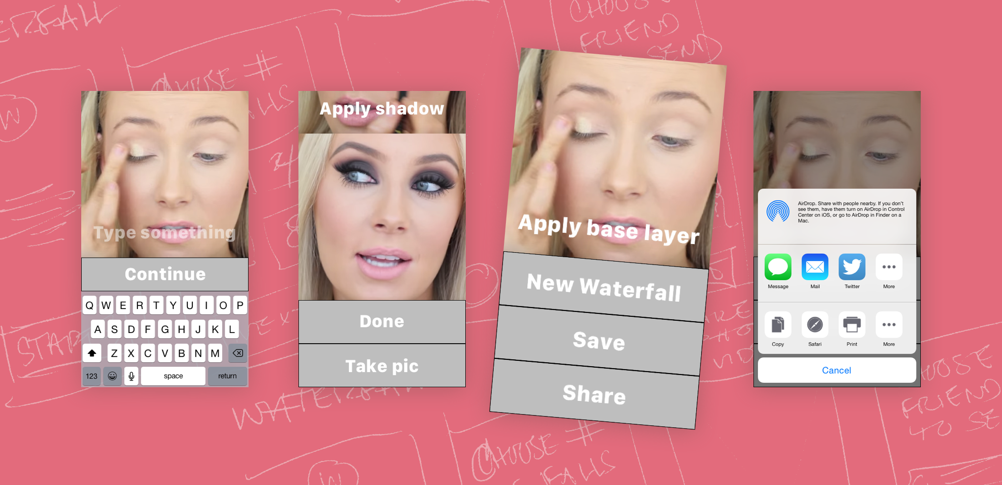
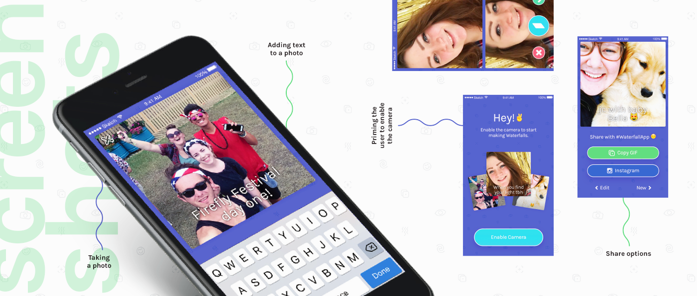
Excited about where my idea was going, I began to refine how the app would work. The app had to be easy to use, but also fast. To streamline the time it takes to create a Waterfall, the app opens directly to the camera. Taking a photo opens the keyboard, triggering the user to add a caption. Tap “Done” and you’re ready to add a photo or create your Waterfall.
A brand to match
As I designed the app, I developed the brand alongside it. I knew it had to be fun, energetic, and expressive—mirroring how the app could be used.
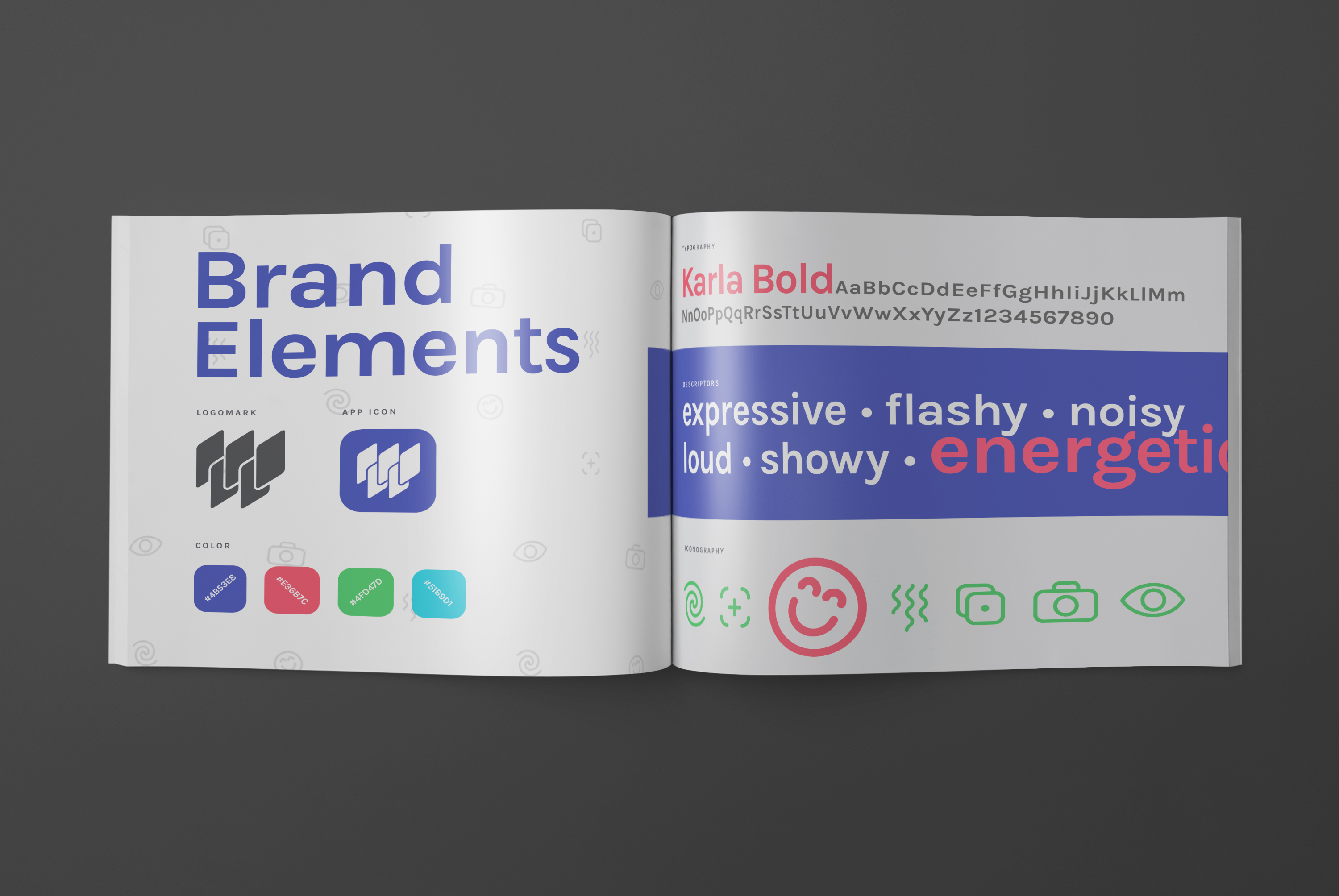
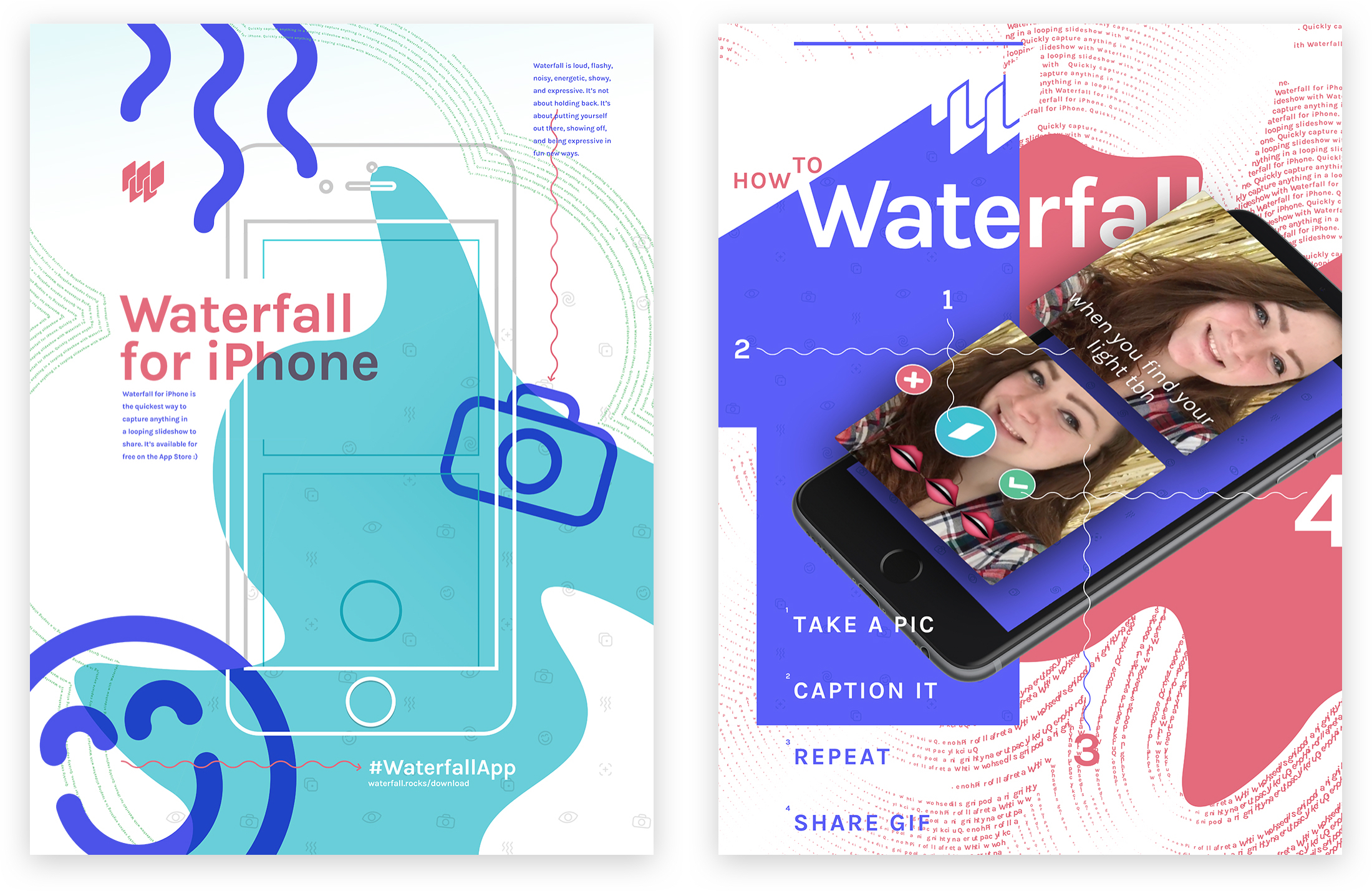
I created a logo that combines a 'W' form with a stack of cards to emphasive repetition as well as the slideshow concept. The animated version of the logo extends this concept and relates to the function of the app.

I created brand icons and a pattern that reiterates this positive energy and winks at camera iconography. I utilized vibrant colors and loud, flashy graphic elements to convey a sense of movement and energy.
Solution
The final app prototype emphasizes a logical user flow. It puts emphasis on a fast, streamlined process of creation. Creating a Waterfall feels fun and easy. Although you can keep adding images, it never feels like you’re very far away from the end result. The end screen encourages sharing to Instagram, but gives the user unrestricted sharing options by allowing them to copy the Waterfall and paste it anywhere they’d like.
The Waterfall brand materials contain a sense of energy and visual noise that is perfect for the brand. It’s showy, noisy, and flashy. The brand is carried across multiple design disciplines, including print, motion, product, and digital, but does not lose consistency.
Results
I presented this project at “Anchor Point,” the 2016 GVSU Graphic Design BFA Exhibition in the Richard App Gallery. The opening reception drew over 300 people who were able to experience and interact with the Waterfall exhibition. ∎
