Personal inspiration
While earning my degree, I wanted to challenge myself to gain a deeper understanding of digital and interactive design in ways that extended beyond what was offered by my department’s available courses. So, I designed an Independent Study course that focused on designing and prototyping an iPhone app. Swipeless is the result.
As a little-to-no-budget college student, I was looking for ways to spend less money on things I didn’t need. Budgeting apps seemed unhelpful. They offered arbitrary categories for purchases that told me when to stop spending, but didn’t tell me how I could improve. I needed a solution that would help me identify unnecessary purchases and help me stop them. Inspired by this, I made it my goal to create an app that helps improve my spending habits.
Exploring the possibilities
I began by exploring the App Store and testing out every budgeting app I could get my hands on. What I found was that most apps just give you a quick overview of your money. They let you see how much you’re spending versus how much you’re earning. Some even subdivided purchases into arbitrary categories. (It’s nice to know how much I’m spending on Home Improvement—not much—but it isn’t really helpful.) By researching budgeting apps and methods, here were a few of my insights:
With these ideas in mind, I began to develop an idea for a budgeting app that simplified spending categories and gave the user tips on how to make less unnecessary purchases. I realized that I first needed to define what an unnecessary purchase would be. Of course, this is going to be different for everyone. That’s how I realized that the user would have to be involved in reviewing their own purchases. Reviewing and evaluating your purchases individually is a good way to start improving your spending habits. The app should facilitate this.
When reviewing purchases, we should evaluate them. Ask yourself: Did this purchase fulfill a need? If not, it probably fulfilled a want. Determining if a transaction fulfills a want or a need is important when it comes to spending money. If we recognize the difference between the two, we will be able to spend less on what we don't need.
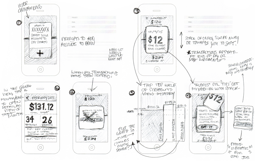
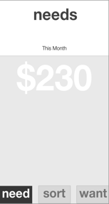
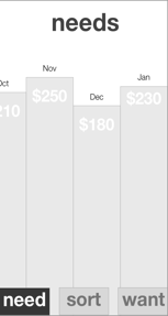
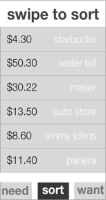
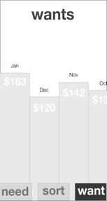
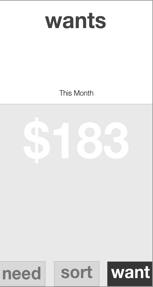
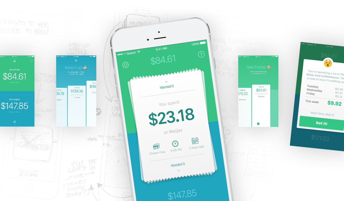
After sketching a few ideas around the idea of reviewing purchases, the potential functionality of the app started to emerge. I created some rough wireframes with three views: One for sorting transactions into Wants or Needs, a second for reviewing Needs, and a third for reviewing Wants.
Prototyping the idea
Next, I began to prototype in order to test my idea. In doing so, I was able to iterate and improve on my original concept. The process helped me to determine that the best way to review purchases is one-by-one, rather than scanning a list. Reviewing purchases one at a time allows you to focus your attention and keeps you from making comparisons between purchases. It also allows the app to show more context surrounding the purchase—when the purchase was made, at what store, and on which credit card.
The solution: content as interface
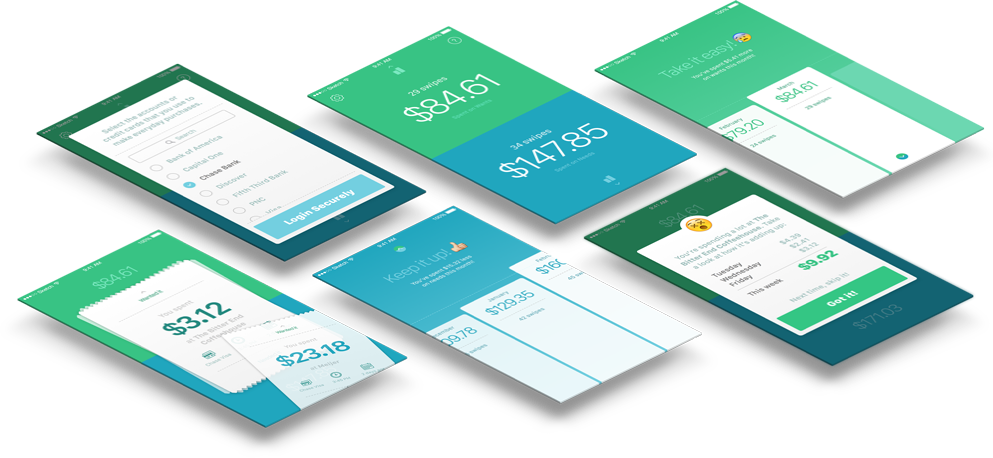
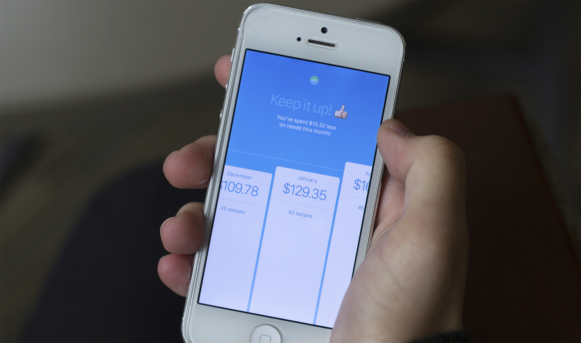
The final solution stresses content as interface. The user connects a bank account or credit card to the app and their recent transactions are loaded into a pile of receipts. The user then swipes up or down to sort each purchase as a Want or a Need. Over time, the app begins to recognize spending patterns based on how the user sorts their transactions and makes intelligent suggestions on how to cut back. Simple graphs make it easy for the user to see how much they spend each month as well as the number of credit card swipes they had. By encouraging personal reflection on your own purchases, coupled with reminders, the app will begin to help you improve your spending habits.
Results
The project resulted in a high-fidelity interactive prototype that was created using Marvel. My prototype was featured in the Marvel newsletter and on the Marvel homepage as a Staff Pick. It has received over 10,000 views.
In addition to the app prototype, I designed a marketing website for Swipeless which showed off the basic features and provided a call to action to download the app from the App Store.
I also presented this app design case study at Student Scholars Day in April 2015, a university-wide research fair that is held yearly to celebrate the scholarship and creative work performed by GVSU students. ∎
