AZEK Building Products
At Real Art, I was an interactive designer and front-end developer on the team that helped reimagine, launch, and continuously maintain the digital experience for AZEK, a high-end performance decking company. We were tasked with creating a site that built affinity for their new premium brand and met the diverse needs of their dual primary audience: consumers and dealers/contractors.
Enhancing the UX for a diverse audience
AZEK relies heavily upon a dealer/contractor network for sales. Knowing this, we constantly referred to the goals and motivations for consumers as well as contractors throughout the redesign process.
For example, when building the Dealer & Contractor Locator we had to consider both the needs of the consumer as well as the professionals who drive most of AZEK's sales. The goal of most consumers using the product was to find high-quality, relevant results for their search. AZEK dealers and contractors, however, were motivated by the AZEK Pro Rewards program to achieve varying degrees of visibility in search results based on their rewards level.
Our Locator solution meets the consumer's needs by displaying results clearly and equally across rewards levels. Consumers also have the option to sort and filter the results. We met the needs of professionals by displaying their rewards program badges inline and by ordering results from highest to lowest level by default. This incentivizes professionals to "level up" to maintain higher search result visibility.
The Dealer & Contractor Locator received over 27,000 lookups in the first 6 months, generating a record number of new leads—proof that our work paid off.

Revamping the homepage based on new insights
Another major part of the project was iterating on the homepage design throughout the life of the project. After the initial launch, we monitored the way people were using the site, following and analyzing the consumer's journey through the sales funnel.
By evaluating the analytics, we learned where the homepage was succeeding and where it was failing to meet our goals of generating consumer leads and increasing the number of requests for product samples.
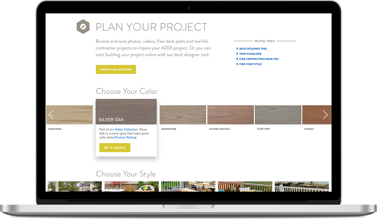
The refreshed homepage emphasizes the simplicity of finding a dealer and provides a low-friction entry point to selecting a product color in order to lead the consumer to ordering samples. With each homepage iteration, we saw the number of swatches ordered and leads generated increase steadily. View AZEK.com.
Cyber Defender Game
Palo Alto Networks came to us when they needed help introducing their next-generation cybersecurity platform in an interactive way. In response, our team designed, developed, and installed an arcade-style video game on a massive touchscreen. The game emulates the benefits of the company's platform and successfully provides an engaging experience for clients who visit their office.
As the lead front-end developer, I knew I was up against a big challenge. I had never built an HTML5 game before, let alone at the scale this project required. I began by researching and testing various JavaScript game frameworks that I knew would help jumpstart the development. After building prototypes using different frameworks, I found that the robustness and low learning curve of PhaserJS would be the best choice for this project.
The next challenge was making sure the game performed correctly on the end device—a massive touch screen that only the client had access to. Not being able to personally test the game on the end device meant that I had to be extra diligent in my work, making sure that my code was cleanly written and would run smoothly under a multitude of conditions.
The final game was delivered and installed successfully in the Palo Alto Networks office. Since the project was ahead of schedule, I was excited to have a few extra days to add effects and animations to the game that were outside of the original scope of the project—just for fun.
Abema iPad Apps
I was the lead designer and developer for a short term project to create two iPad apps for a pharmaceutical company. The purpose of each app is to assist salespeople during in-person training sessions for a drug that treats certain breast cancers. Each app allows trainees to track their activity progress and be directed to different areas in the training rooms in a "Choose Your Own Adventure" style.
The client requested that the project appear fairly brand-agnostic, yet still be colorful, clean, and modern. The apps also had to be very easy to use since the training sessions occur over just one day and those using the apps would need to be able to understand what to do right away.
By using color minimally but intentionally, I was able to create a design that looks friendly without being branded in a specific way. To make sure that the app was intuitive and simple, I followed UI conventions and used motion purposefully to create a logical flow of information. Since every user was a first-time user, I kept the content on each screen to a minimum, focusing on only one or two available actions so that the path forward was clear. After launch, we received positive feedback on the apps from both the client and the trainees. ∎
