Crafting a story
When my classmate and I were tasked with developing an olive oil brand, we didn't know where to start. There were just too many directions we could take. In order to focus the project, we wrote a brand story. We determined that the store is located in Rockport, Massachusetts and imports quality olive oils and vinegars produced in small batches by artisans in Italy, Spain, Greece, and Portugal. We did research on the history of Rockport as well as determined what days the store would have tasting events. All of this helped us to get into the mindset of the brand, allowing us to create an outcome that is focused.
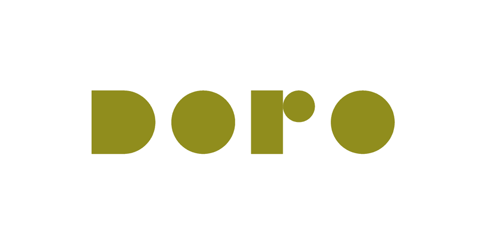
We experimented with many different possibilities for a wordmark. We expanded on one direction that echoed the curvature of goopy oil bubbles, creating multiple variations of a similar mark. Our final logo incorporates this with the elegant, modern appeal we were looking for.
Designing the brand
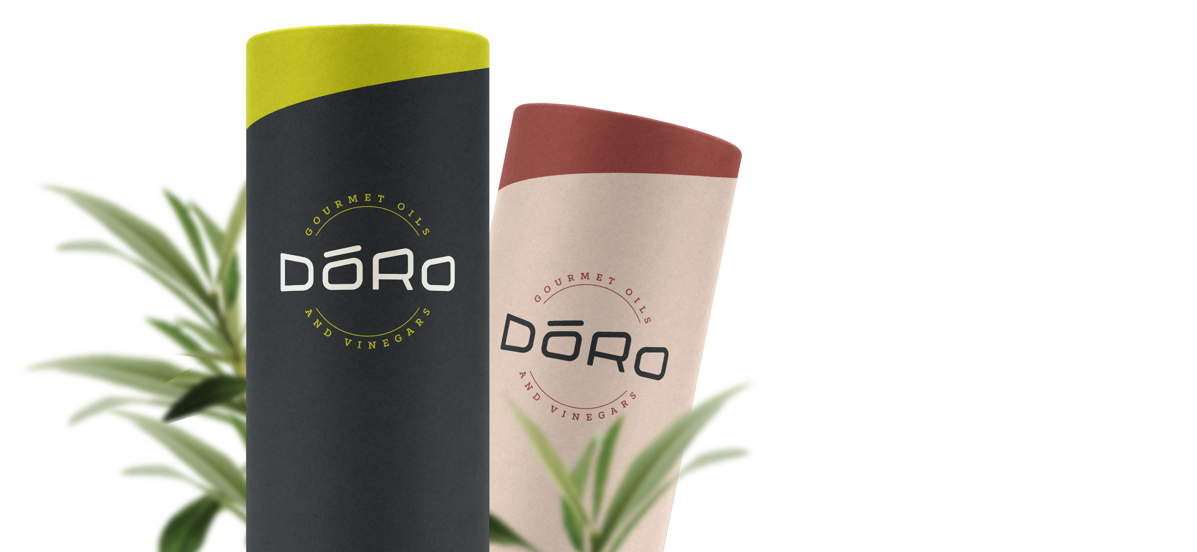
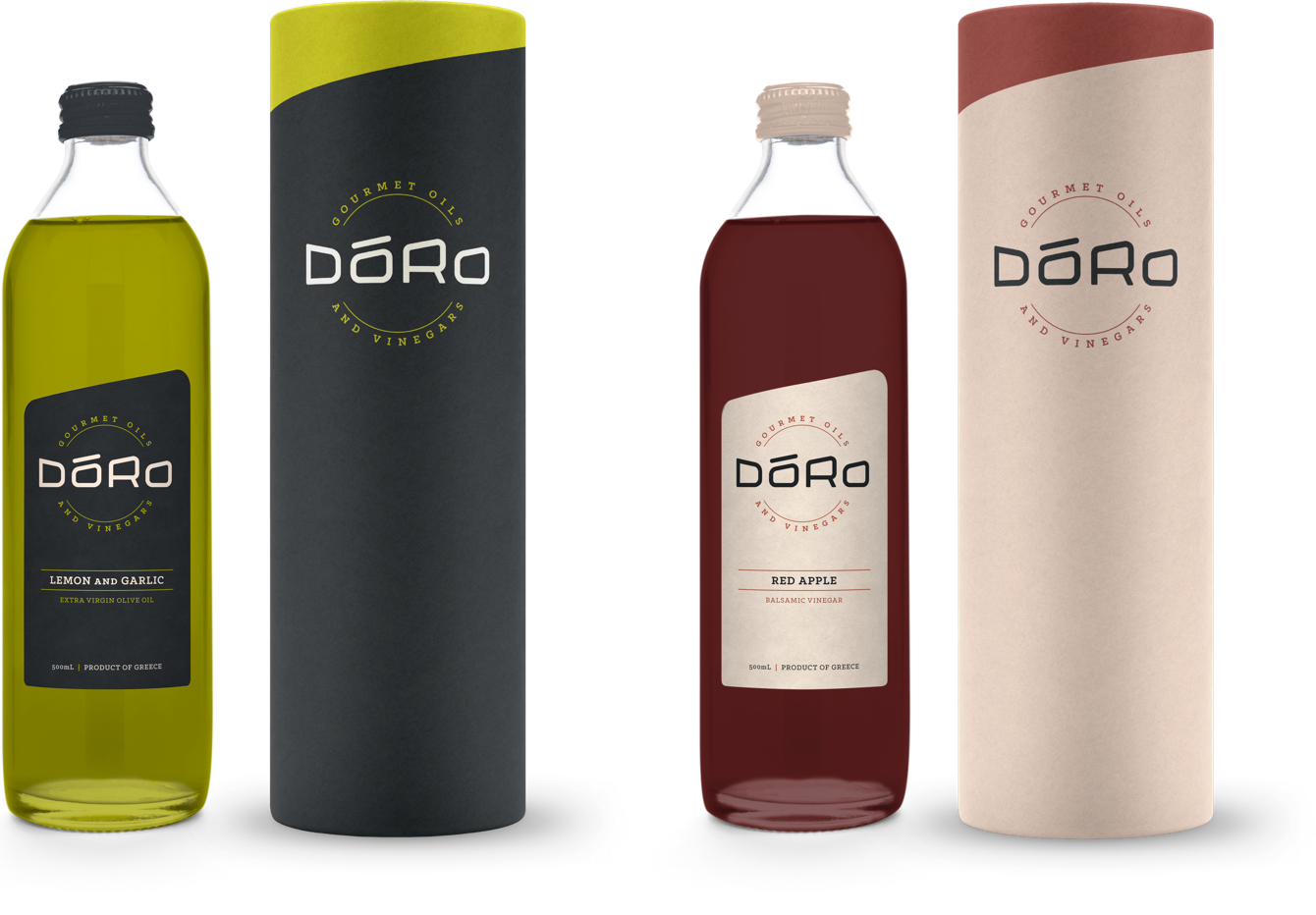
We kept our packaging simple in order to continue to express the brand as being upscale and quality. The diagonals used in the logo are expanded into other brand elements as a way of tying them all together. Textured paper labels give the packaging a little bit more of an authentic, hand-crafted feel.
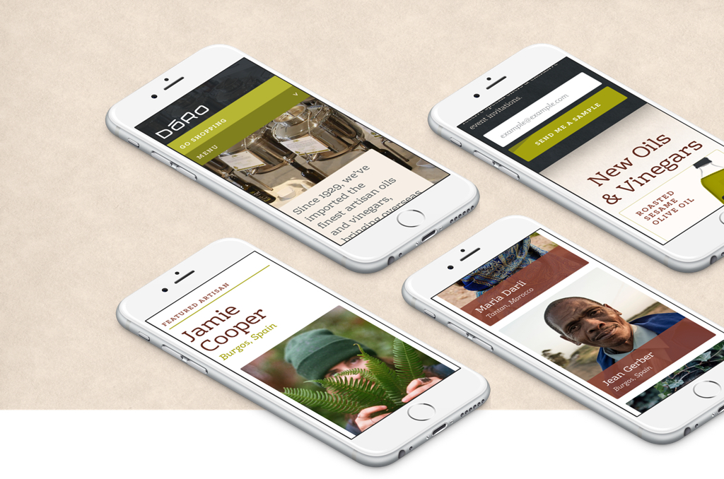
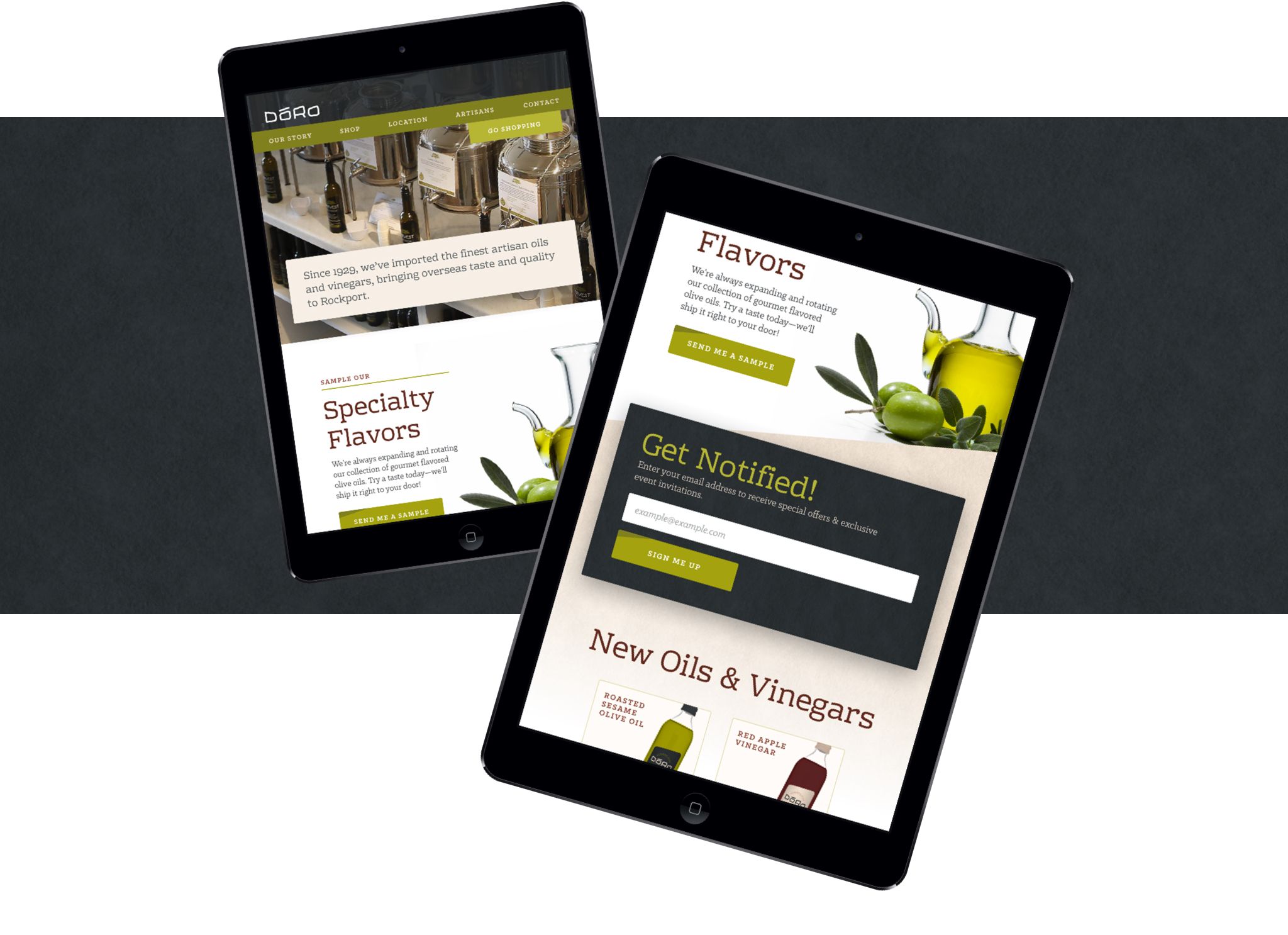
Ecommerce website
I designed a website that focused on driving sales for the company. I did this by prioritizing the featured products, as well as highlighting the story behind them. Since Doro imports their products from artisans around the world, we decided to highlight different artisans. With specialty products, people enjoy learning about where they're from and the people who make them.
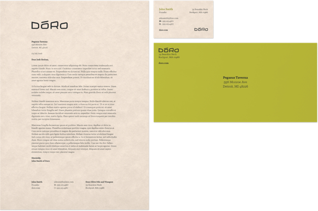
Our minimal approach to the brand's stationery set takes after the packaging. The same textured paper is used in order to give the traditional feel. ∎